Dashi
Client
DASHI Ramen Concept, Japanese restaurant
Year
2024
Technologies
WordPress, Elementor, TranslatePress
(About the project)
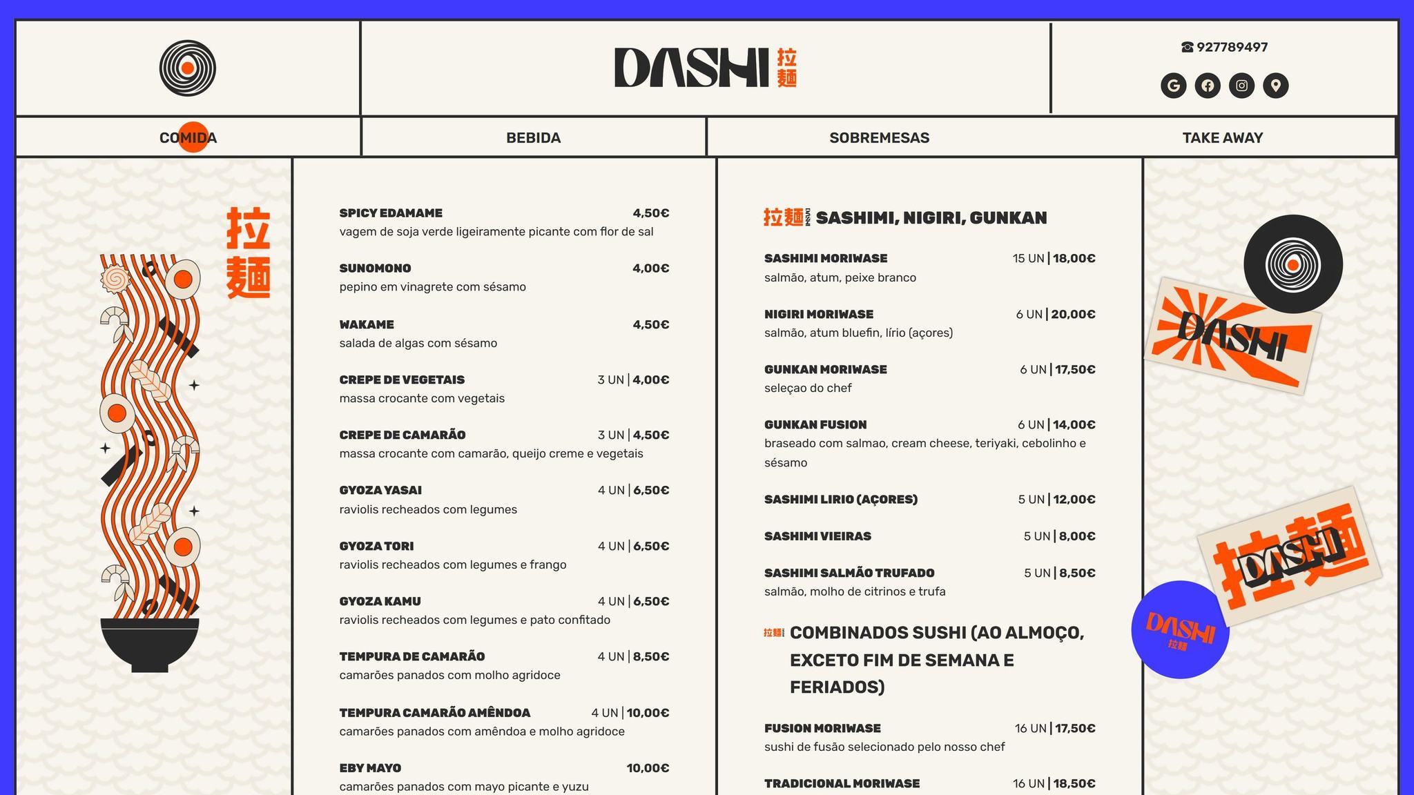
A digital menu for DASHI, a ramen and sushi restaurant with an extensive menu. The menu is split into four tabs, food, drinks, desserts and takeaway, and follows the identity of the restaurant: a blue frame, its own illustration for each tab and headings marked in orange. It is available in Portuguese and English.
- Web design
- WordPress development
- Digital menu
(01) Tabs
Four tabs
The navigation bar always shows the four parts of the menu. An orange circle marks the open tab, and pages change with a blue transition, the colour of the frame.
(02) The menu
One menu, four parts
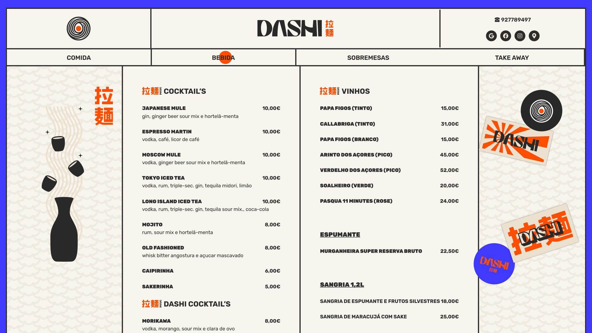
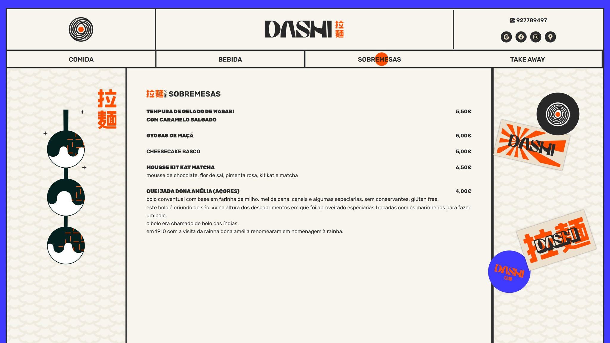
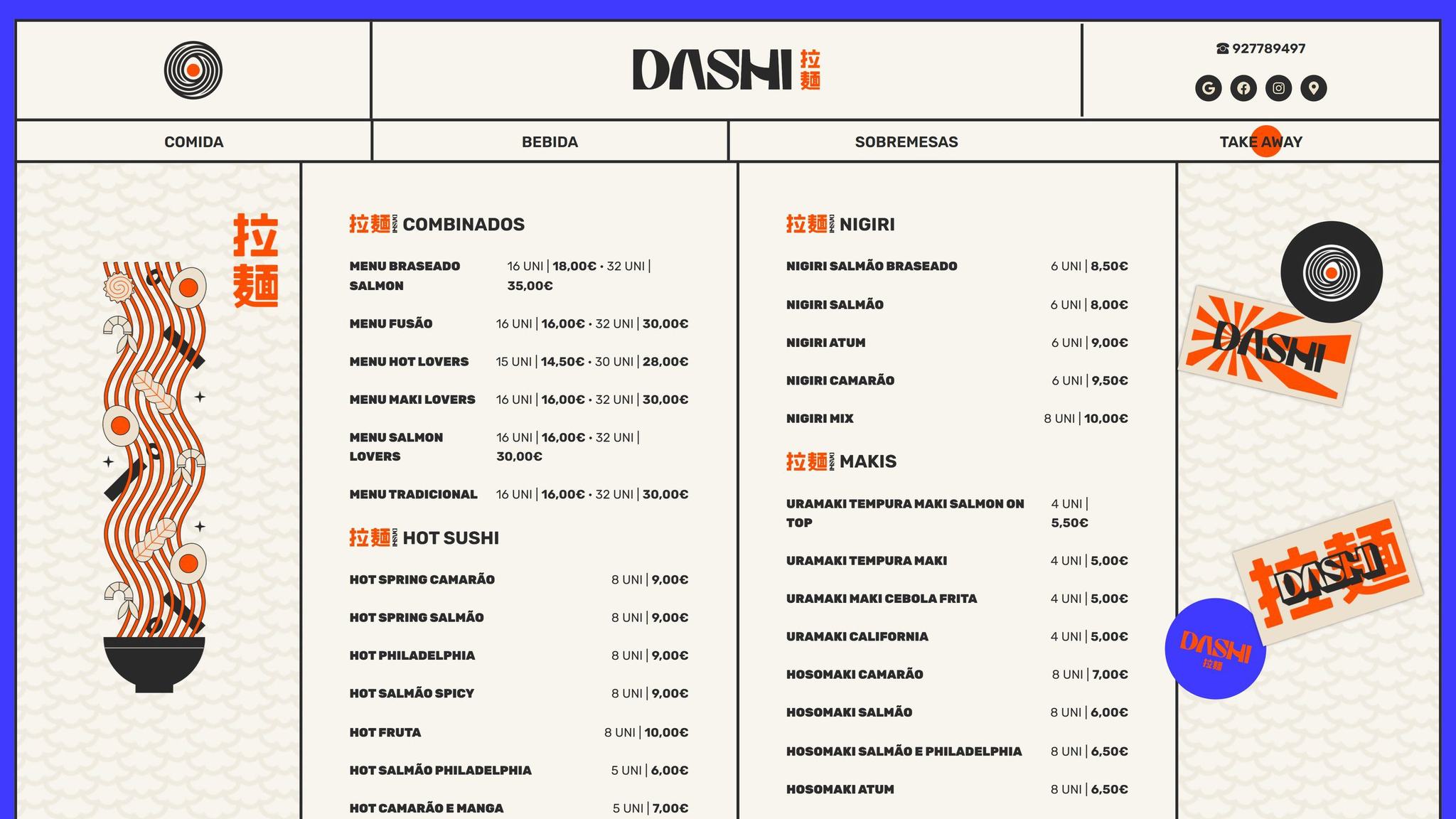
On desktop, the menu fills the two middle columns. The sides stay fixed: on the left, the illustration of the tab; on the right, the brand stickers.
- 01Food: soups, sashimi, sushi, ramen, donburi and katsu
- 02Drinks: cocktails, gin, wines, sake, Japanese beers and tea
- 03Desserts: from wasabi ice cream tempura to an Azorean queijada
- 04Takeaway: sets, hot sushi, nigiri, maki and temaki
(03) A long menu
Dishes, pieces and prices
Each dish has a name, a short description, the number of pieces and the price aligned to the right. Each group opens with an uppercase heading and the Japanese characters for ramen in orange.
(04) Illustrations
One illustration per tab
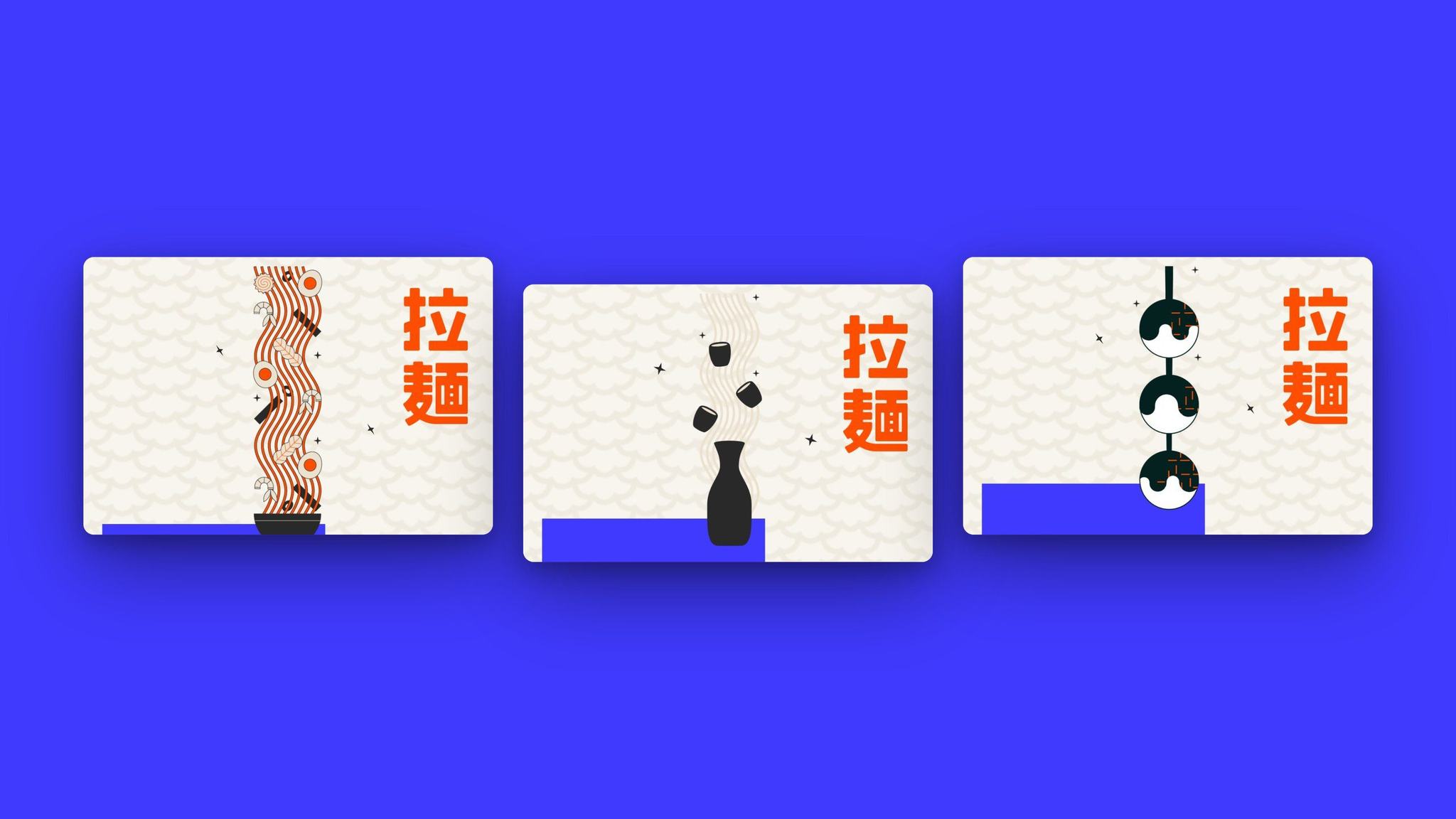
Each tab has its own drawing: the ramen bowl for food and takeaway, the sake bottle for drinks and a skewer of sweets for desserts. On the phone, the illustration opens each page.
Blue frameThe whole menu sits inside a blue frame with black lines, like a printed menu.
Wave patternThe side columns use a Japanese wave pattern, cream on cream.
StickersThe logo stickers stay fixed in the right column while the menu scrolls.
(05) Details
Bilingual and easy to read
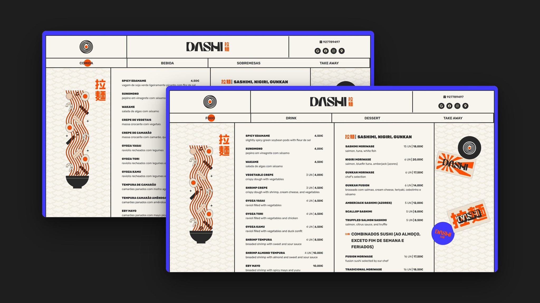
Portuguese and EnglishThe whole menu is also available in English, with the same design and the same prices.
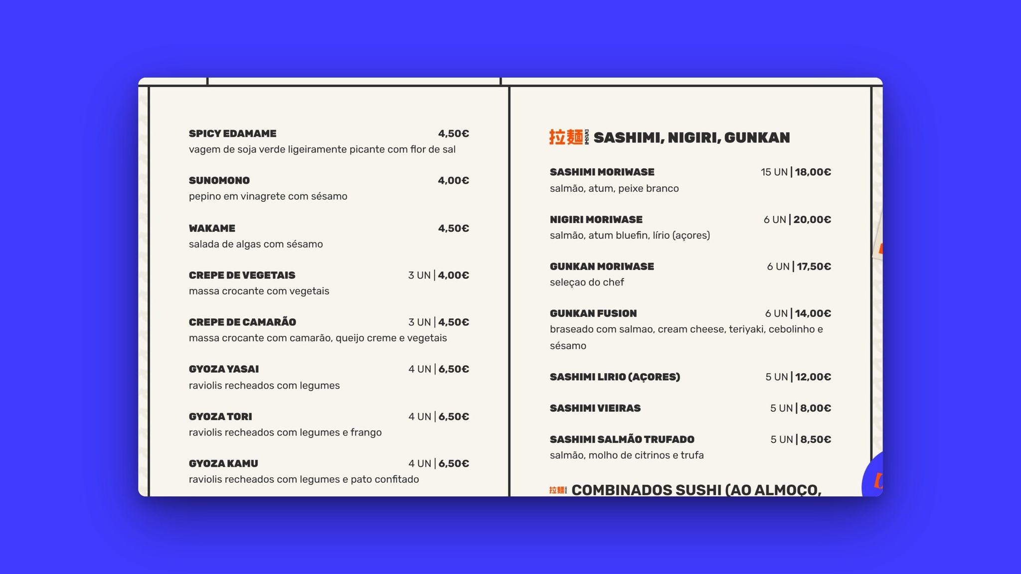
Menu detailNames in bold, short descriptions and prices always in the same column.
(06) Mobile
Mobile version
On the phone, the header and the tabs stay fixed at the top, the illustration opens each page and the menu becomes a single column.
(07) All pages
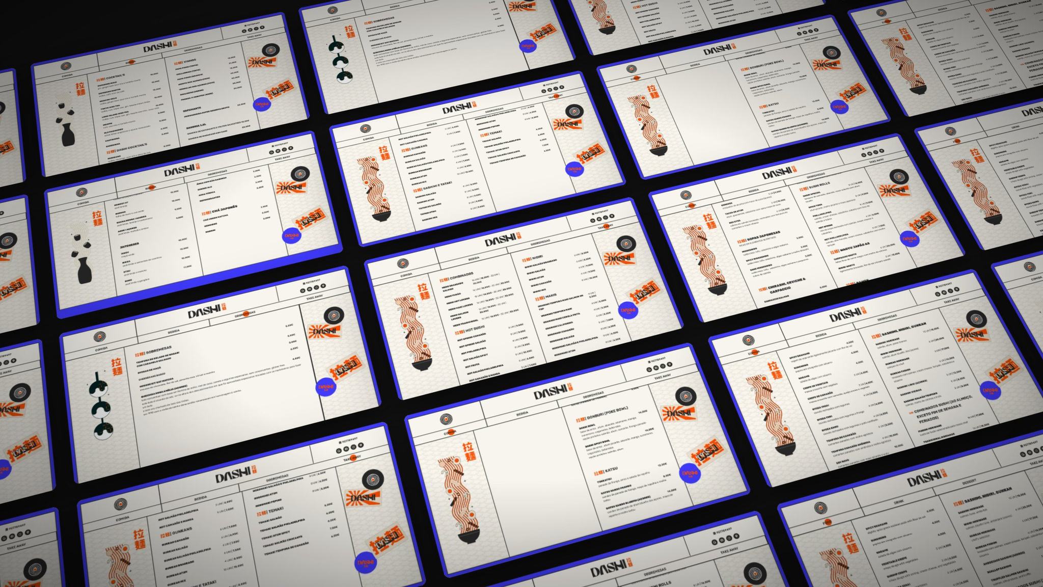
(08) Full walkthrough
From food to takeaway, sped up